What is the connection between signage and a property’s image? And how can wayfinding aids be made visible even in environments where information is overwhelming?
In this edition of our Expert Tips, we outline the function and benefits of wayfinding systems, supplemented by insights into practical implementation. At the same time, we are continuing our series on specific communication options for property, which has been a feature of the Valdivia Newsroom for five years now.
The key benefits: wayfinding and identity
Wayfinding systems and signage are more than just useful orientation aids. As a strategic approach, they combine visual communication, architecture and design. Through a consistent, well-thought-out design language, they can shape the image of a property or a neighbourhood – with benefits for the user experience and brand identity1/2/3 :
- They provide orientation and information as a service that requires no staff, leads to fewer complaints and increases visitor/tenant satisfaction.
- Wayfinding also means safety – for example, finding the right shop in a shopping centre or the correct gate at an airport.
- Another important function of such systems is to improve accessibility and remove barriers for people with disabilities4 .
- Finally, they create a visual and aesthetic link that conveys a sense of place and acts as an anchor of identification for residents or regular visitors.
Such signage systems therefore have a very concrete significance for the value and marketing of a property, as they shape and support a brand story based on practical benefits.
Key elements: signage and fonts
Depending on the type of use, floor plan and size of the building, wayfinding systems and other orientation aids can take very different forms. In a block of flats, a house number, nameplates at the entrance and on the flat doors, and, where necessary, signs for the lift, basement, garage etc. are usually sufficient. A large hospital or an airport, on the other hand, require multiple aids such as a colour-coded system, overview and floor plans, directional signs, an address system for wards or gates, as well as Braille labelling and pictograms.
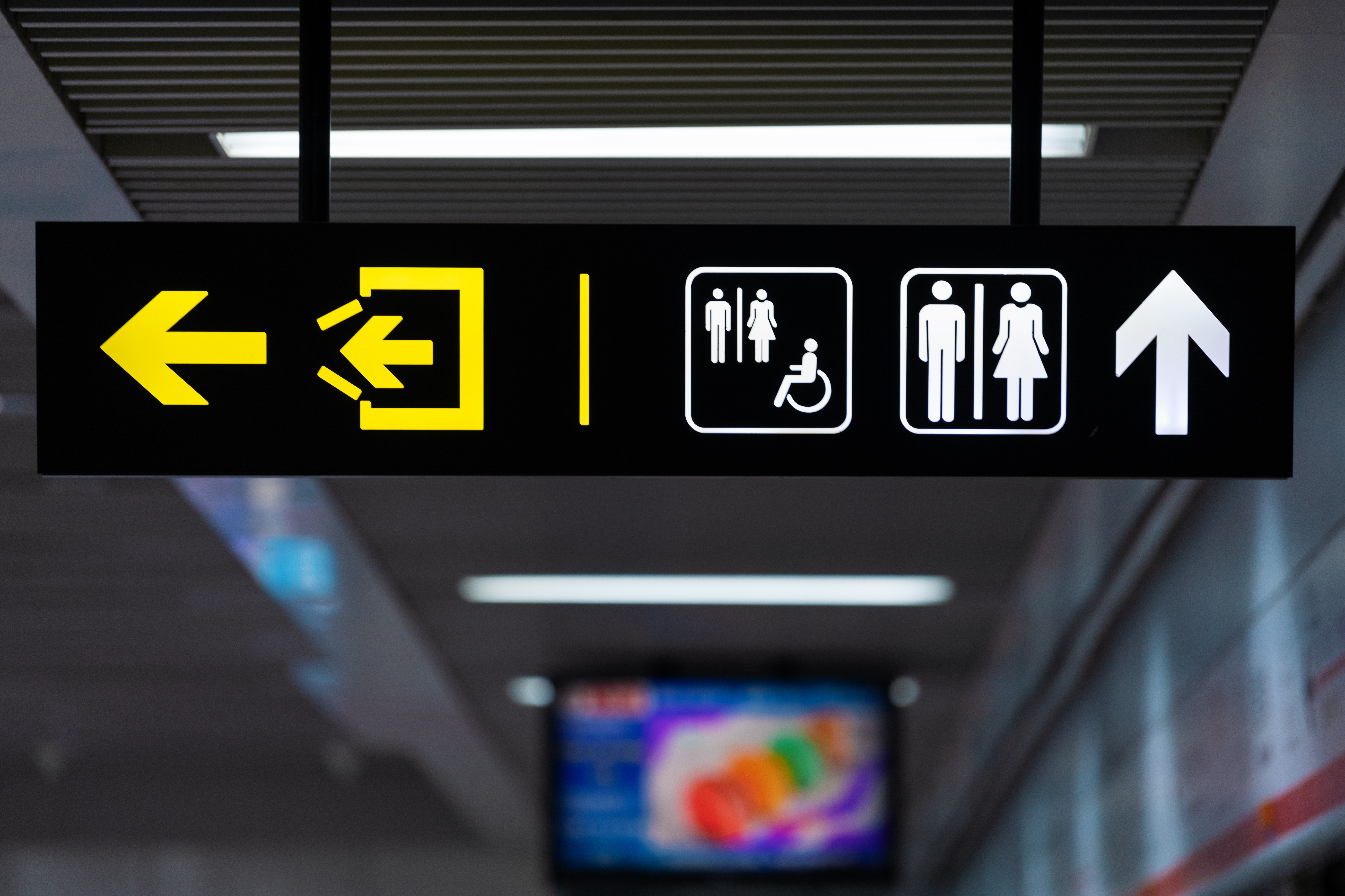
All non-verbal elements, such as arrows, symbols, pictograms, etc., fall under the term ‘signage’. It forms a universally understandable visual language that encompasses design, colour theory, psychology and cultural references5 . Signage also includes ornamental elements, known as dingbats, the use of which in architecture we introduced some time ago. As with typographic elements, coherence and brand identity in signage are achieved through a conceptually grounded choice of fonts and colours, for example through
- colourful, playful characters and cartoon-like animal symbols for a nursery,
- neutral, calm typefaces and colours for infrastructure and office properties,
- deliberately makeshift industrial design for a start-up co-working space,
- nostalgic lettering on enamel signs for a historic building.
Key to success: clarity and unambiguity
According to our research, there have been very few scientific studies specifically on wayfinding systems to date. A US comparative study4 on indoor orientation, based on 84 individual studies, highlights some interesting findings from a survey of healthcare facilities:
- Signage could not completely compensate for orientation problems when floor plans became too complex. However, such signage still proved more effective than site plans with location markers.
- Visitors found it easiest to find their way around using standardised pictograms featuring simple, human figures and clear colour contrasts.
- Signs that contained both words and symbols were understood most quickly and caused the fewest instances of people going the wrong way. Signs containing only words came second, whilst signs using symbols alone were the least helpful.
A Japanese study6 examines a particular aspect of wayfinding aids, focusing on the effectiveness of different types of signage in emergencies. Floor markings proved to be the most effective option. In contrast, four-sided ceiling signs, interestingly, often led to uncertainty, as some test subjects saw two sides that appeared to indicate two different directions. In summary, both studies point to an aspect that is important in practice: when in doubt and under stress, perception tends to follow the unambiguous sign rather than the one that may be more sophisticated in design.
Solutions for complex environments
Some environments, such as shopping centres and airports, are heavily cluttered with signs, illuminated lettering, advertising and other visual elements. A doctoral thesis on the situation in shopping centres7 analyses why wayfinding systems there are often barely noticed. In addition to the large amount of competing information, the cause is a lack of hierarchy, combined with confusing spatial structures. Various methods can be employed to design a wayfinding system that is effective even in such environments:
- Reduction and hierarchy
Where possible, the number of information sources should be reduced. In larger buildings, a hierarchy comprising clearly defined main routes and a logical zoning system—such as a separate food court in a shopping centre—is helpful.
- Visual clarity
Consistent, understated colour schemes and typography, supplemented where necessary by pictograms, help distinguish signage from advertising elements. Here too, simplicity is key: for example, signage in Frankfurt’s MyZeil shopping centre features white lettering and symbols on neutral anthracite-coloured surfaces, thereby standing out from the brightly coloured shops and their advertising.
- Positioning
Signage should be positioned so that it lies within clear lines of sight and does not compete directly with other visual elements. This can be achieved through floor or ceiling placement, freestanding information pillars, or a protective space around the relevant signs.
- Architecture
In addition, for new buildings and major refurbishments, it is also advisable to incorporate this into the architectural design: clear sightlines, distinctive anchor points and open junctions support an intuitively comprehensible wayfinding system.
The study mentioned above sets out detailed design recommendations for ‘innovative, intuitive and safe wayfinding systems’. It also includes a comprehensive checklist for assessing and optimising existing systems. Whilst the recommendations reflect the state of the art as of 2010 and mention digital wayfinding aids only as a future prospect, However, analogue visual signage elements are likely to remain necessary in the foreseeable future, meaning the study remains relevant for current projects as well.
Conclusion: Functionality and aesthetics
Signage and wayfinding systems often go unnoticed in many property sectors; it is usually only their absence or lack of clarity that stands out. Their practical utility is nevertheless beyond question. Being able to orientate oneself quickly and safely within a space is a basic human need and is unlikely to be completely replaced in the long term by AI-supported aids such as smart glasses and other augmented reality systems.
For the image and marketing of properties, professionally designed wayfinding systems offer a dual advantage. Their functionality promotes a positive experience for visitors, residents or other user groups. This boosts overall satisfaction, ensures positive reviews and, ultimately, leads to greater value creation. At the same time, a well-thought-out design supports and shapes brand identity and, as a unifying design element, fosters a sense of belonging and a distinct profile – standout features that support marketing efforts.
Sources
- “Why good signage is important in neighbourhoods”, Immobilien Aktuell by Immokom, August 2023
- “How to build your brand with better wayfinding”, Colorado Real Estate Journal, April 2018
- “The ROI of High-Quality Indoor Signage for Multi-Unit Properties & Commercial Spaces”, MtnHigh Sign + Design, June 2025
- “Wayfinding in Interior Environments: An Integrative Review”, Frontiers in Psychology, November 2020
- “Signage – Architectural Wayfinding Systems for Greater Safety in Spaces”, architektvergleich.ch (Swiss architect search portal), undated
- “The impact of people-signage interaction on wayfinding evacuation behaviour”, Fire Safety Journal (on sciencedirect.com), January 2024
- Dr Nadine Seumenicht: “Analysis and evaluation of existing wayfinding systems to develop design recommendations for innovative, intuitive and safe wayfinding systems in publicly accessible buildings, using shopping centres as an example”, University of Duisburg-Essen Publications, May 2010
(Image source: istockphotos.com)